A concept task app built on one belief: a list should lower your mental load, not add to it. I set out to merge the structure people need to plan a whole life — areas, projects, scheduling — with the calm of a clean daily view.
Most task apps force a trade-off: rigid project management on one side, a flat checklist on the other. The goal was to hold both — areas and projects deep enough to organize everything, and a capture-and-do flow light enough for the next five minutes.
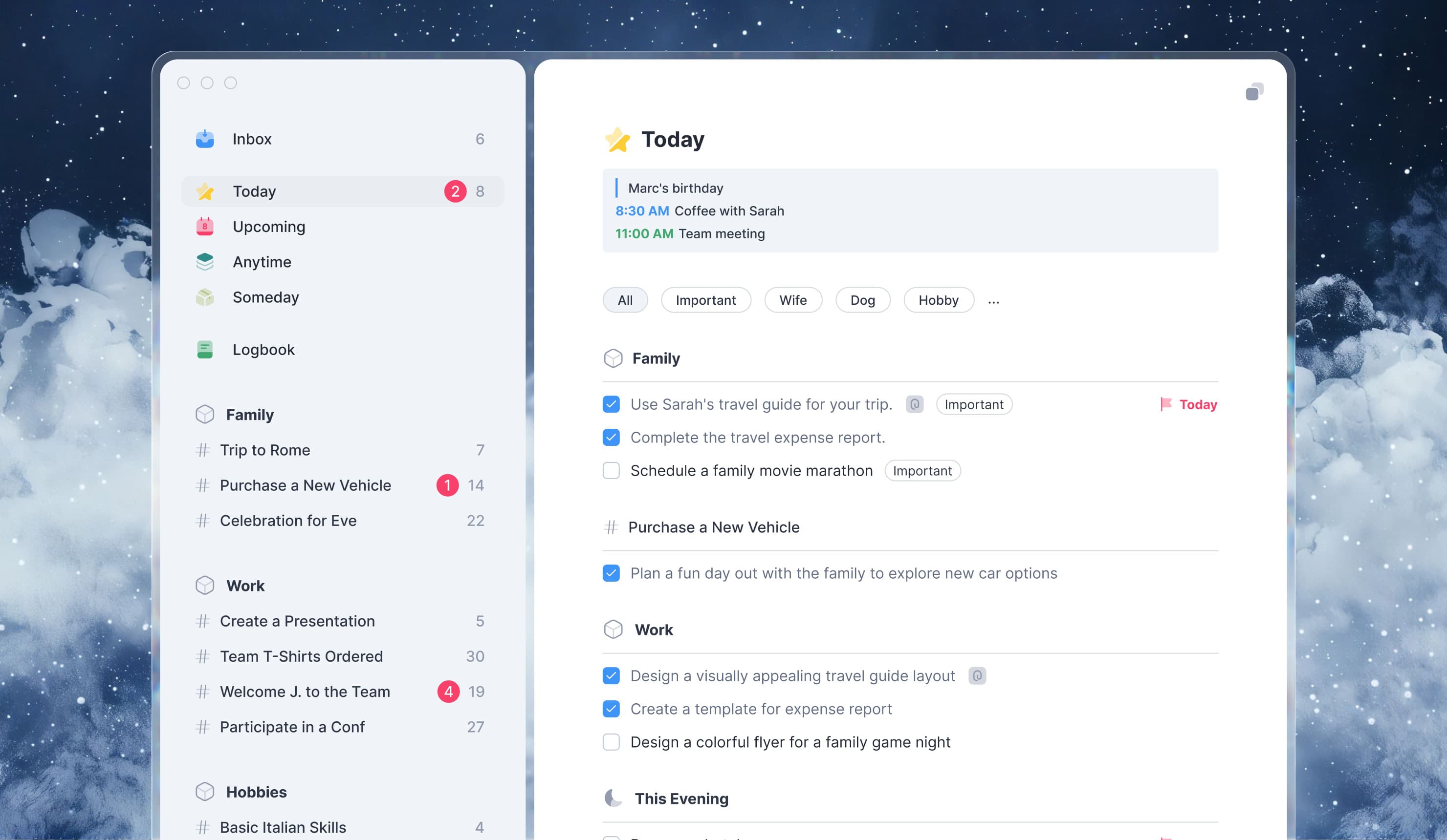
I designed the experience end to end — the brand, the interaction model, a token-based design system, and build-ready specs across web, iOS, and Android.
- Research
- Prototyping
- Usability testing
- User journey mapping
- Strategy
- Brand narrative
- Tone of voice
- UX strategy
- Design & Production
- Brand design
- UX & UI design
- Design system
- Dev documentation
- Platforms
- Web
- iOS
- Android
- Role
- Concept · Freelance
- Year
- 2025
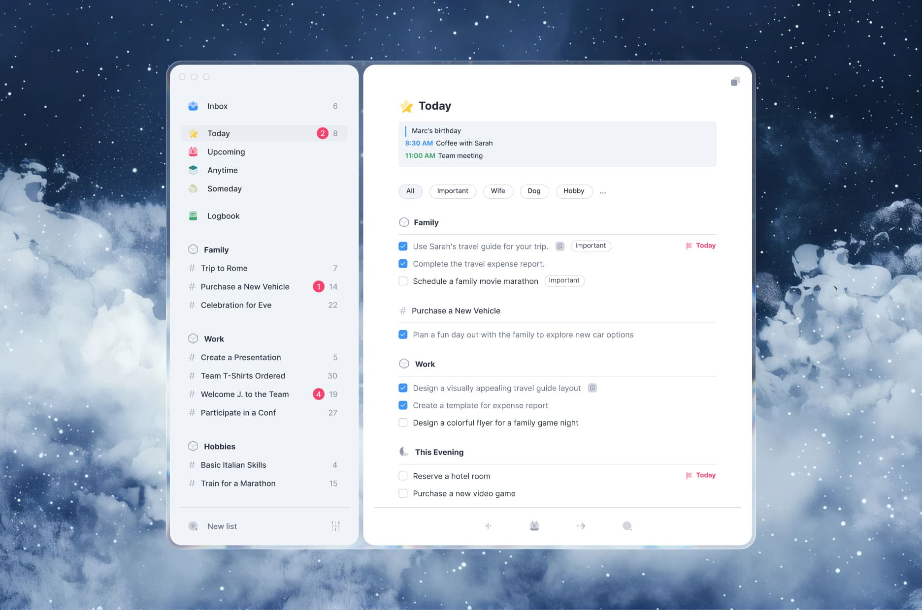
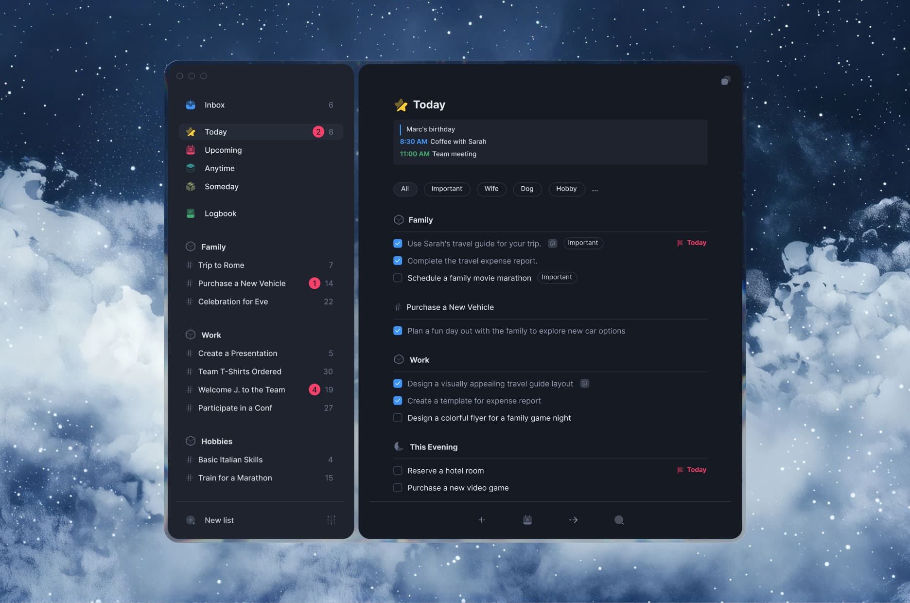
One place to capture, plan, and look back
Time-based views — Inbox, Today, Upcoming, Anytime, Someday — let anything be captured in a second and scheduled later, while Areas like Family and Work keep long-running threads apart from the noise. The Logbook quietly stores what you finish, so progress stays one glance away.
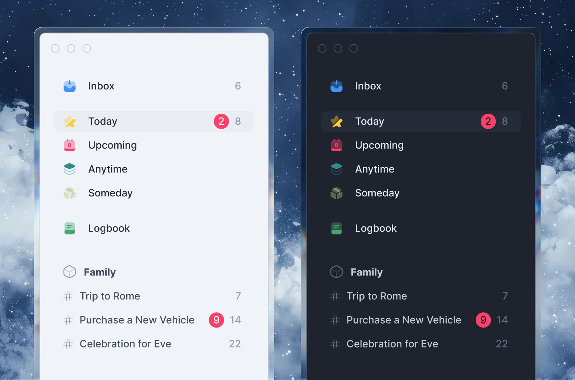
Capture in a second, organize without friction
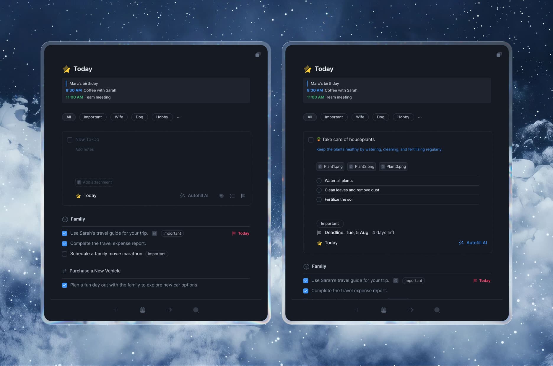
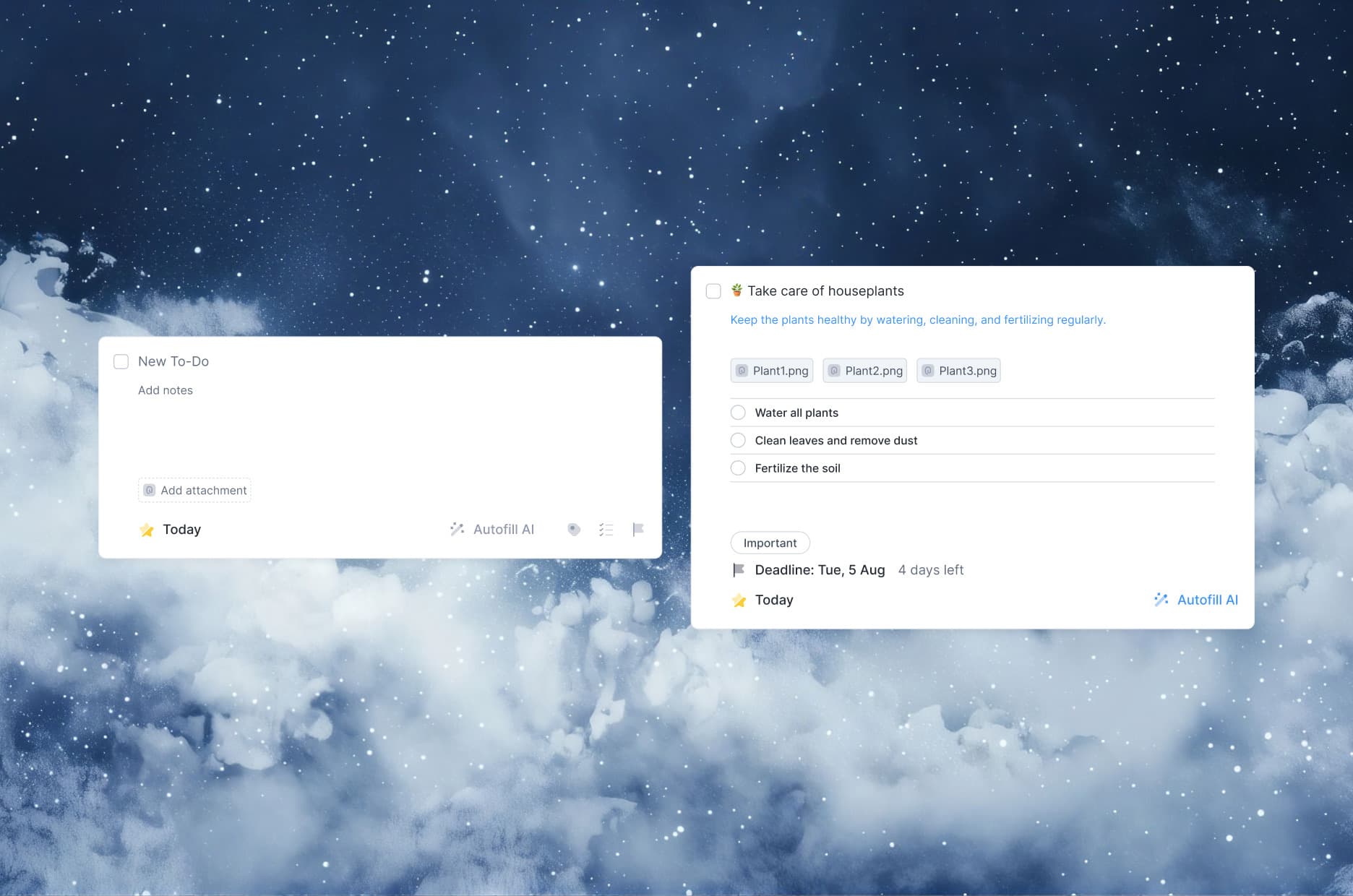
The core list is built for speed: one tap adds a task; dates, notes, and tags attach without leaving the keyboard. Tasks group under projects with a live progress ring, and lightweight tags cut across lists so the same item surfaces wherever it's relevant.
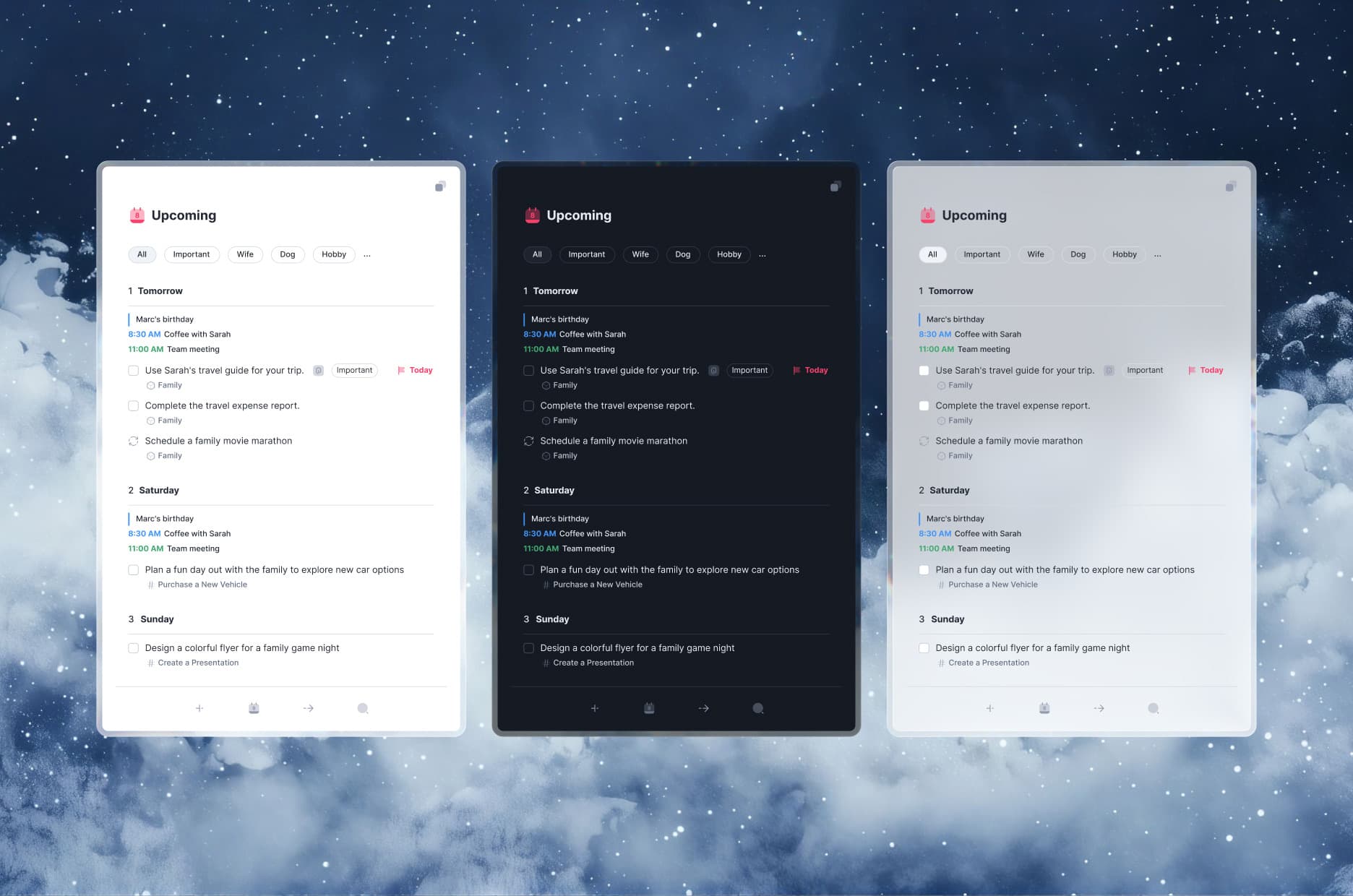
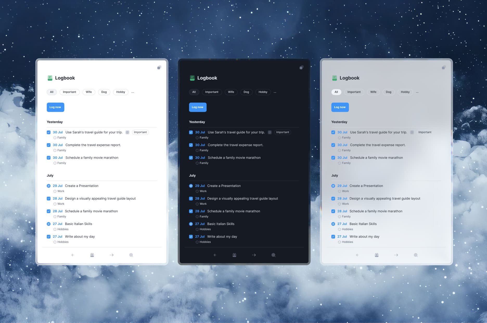
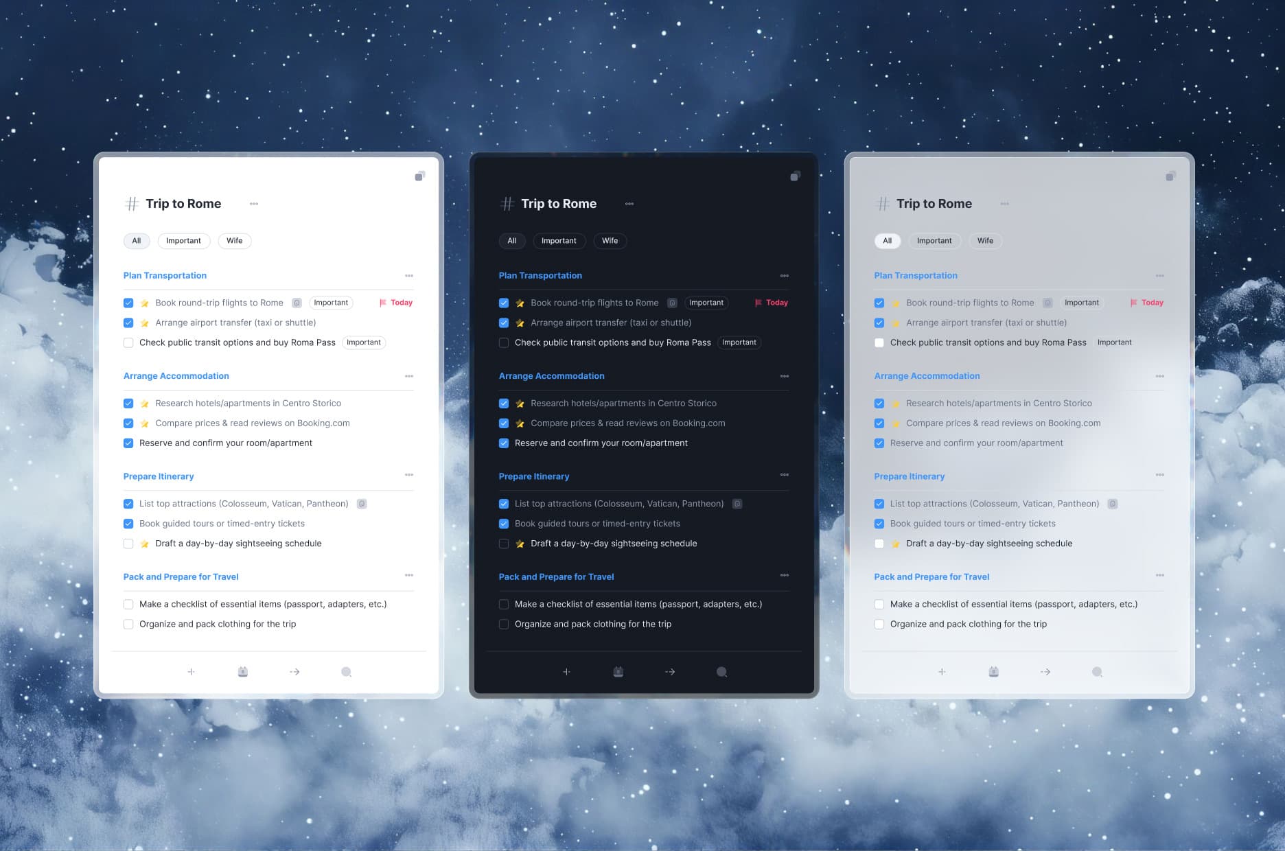
Areas and projects to hold a whole life
Every Area and Project gets its own page — tasks, headings, and notes in one scroll. It scales from a quick errand to a months-long plan without ever changing how it feels to use.
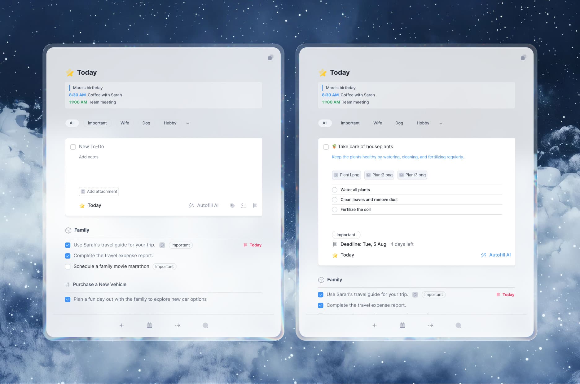
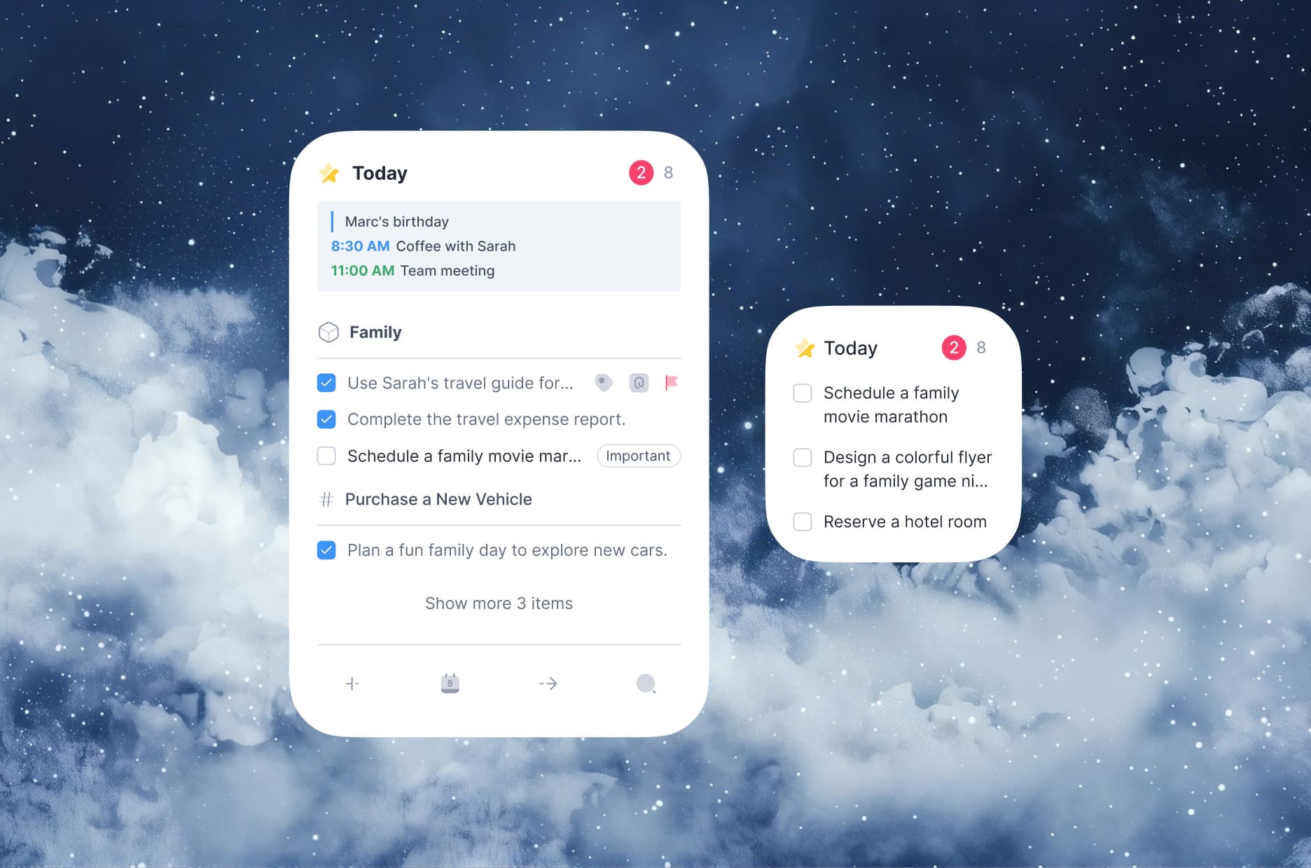
Today shows only what belongs to the day — scheduled tasks, events, and anything due, pulled from every Area into one calm list. This Evening sets aside what can wait. No infinite backlog, no guilt.
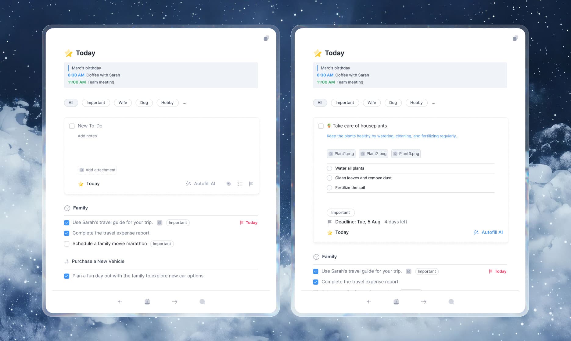
Your day, a glance away
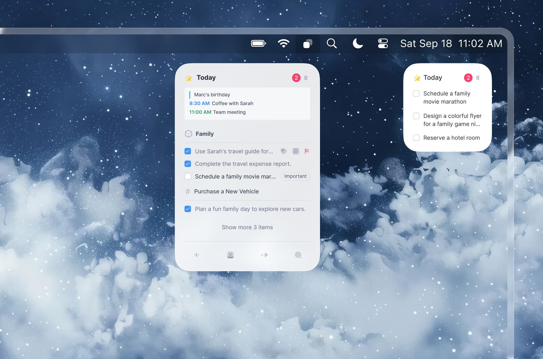
The home-screen widget lifts Today onto the device: the next few tasks and events, a one-tap complete, and a size that adapts from a compact list to a fuller agenda. Made to be checked in passing.
Outcome
Cohesive design system
A token-based set of components, type, and color that keeps every screen consistent and fast to extend across platforms.
A daily flow that lowers mental load
Time-based views and a realistic Today turn a long backlog into a clear, achievable plan — the core bet of the project.
Structure and simplicity, together
Areas, projects, and cross-cutting tags add real organizational depth without ever making capture feel heavy.
A concept treated like a product
Clear patterns, states, and platform specs that hand off straight to development — designed to be built, not just admired.
Next project
StripesInc — Omnichannel Platform
A white-label Chatwoot redesign, with its design system.
2026