A concept redesign on top of Chatwoot, the open-source customer engagement tool. I explored how a more refined, scalable, brand-flexible UI could improve usability and white-label adoption in B2B.
Not a repaint — a rethink of the experience for teams handling high conversation volume across channels (WhatsApp, email, webchat, Instagram).
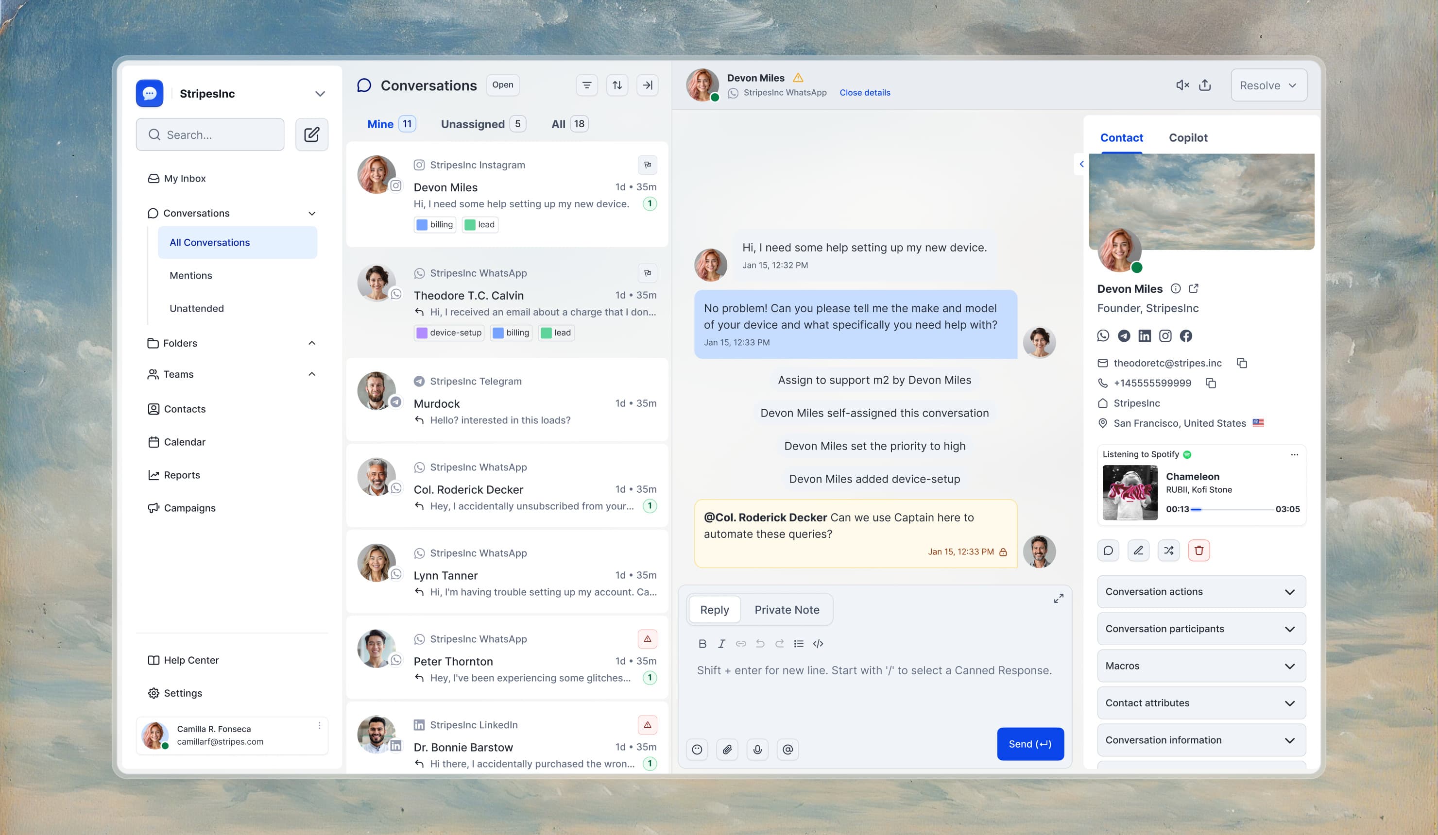
The focus was on creating a modern interface aligned with SaaS product standards, while also offering design system components adaptable to any brand.
- Research
- Prototyping
- Usability testing
- User journey mapping
- Strategy
- Brand narrative
- Tone of voice
- UX strategy
- Design & Production
- Brand design
- UX & UI design
- Design system
- Dev documentation
- Platforms
- Web
- iOS
- Android
- Role
- Concept · Freelance
- Year
- 2026
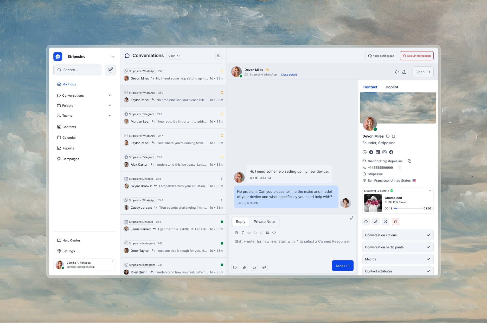
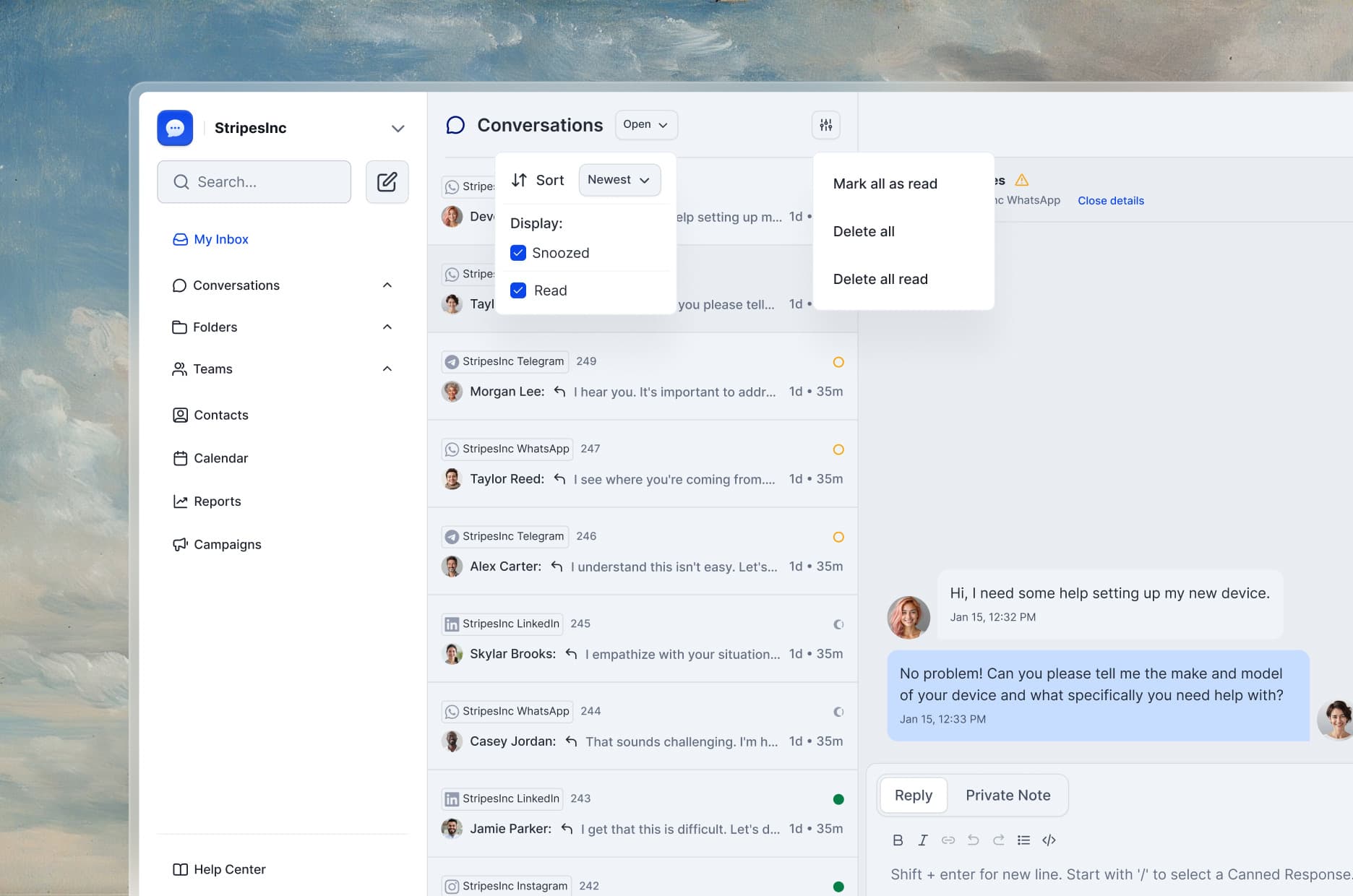
Personalized, prioritized, productive
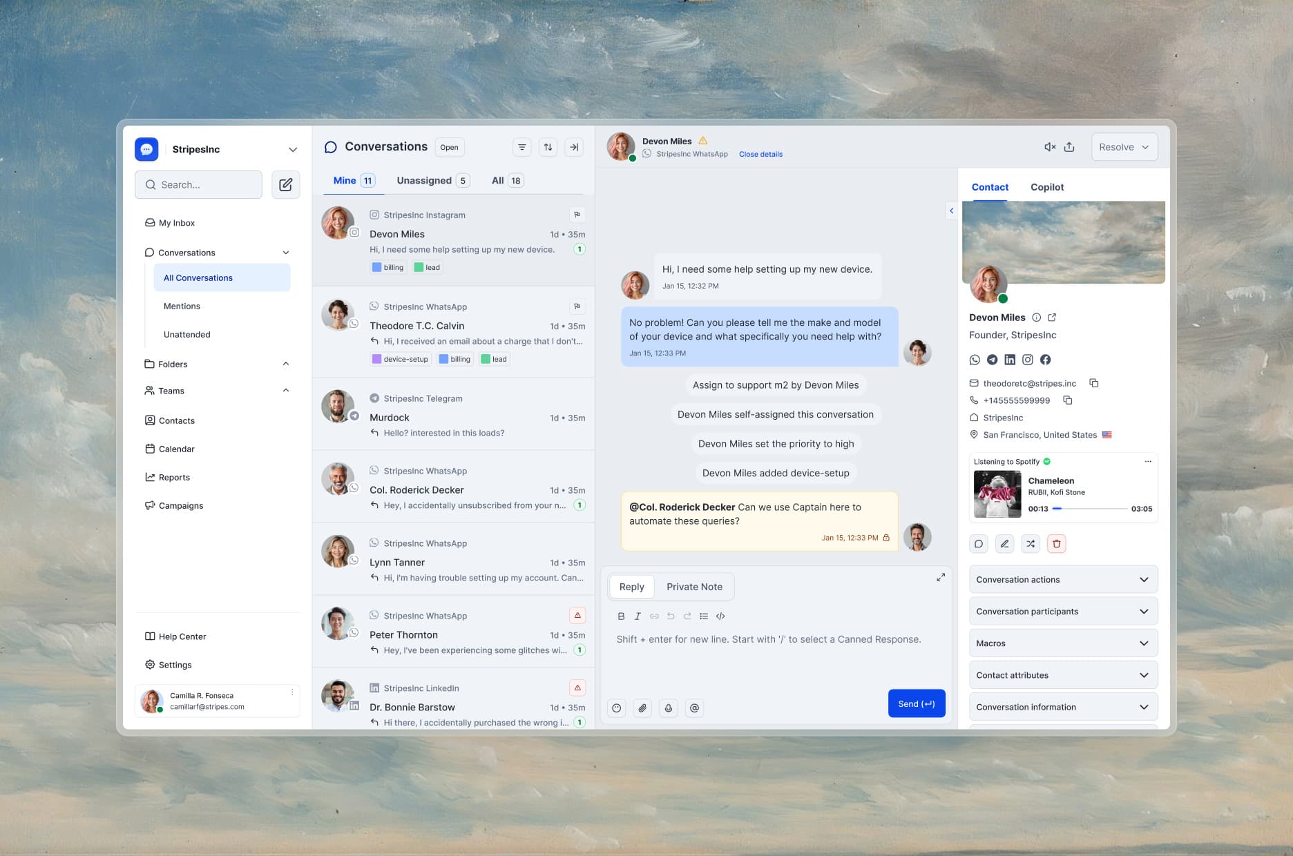
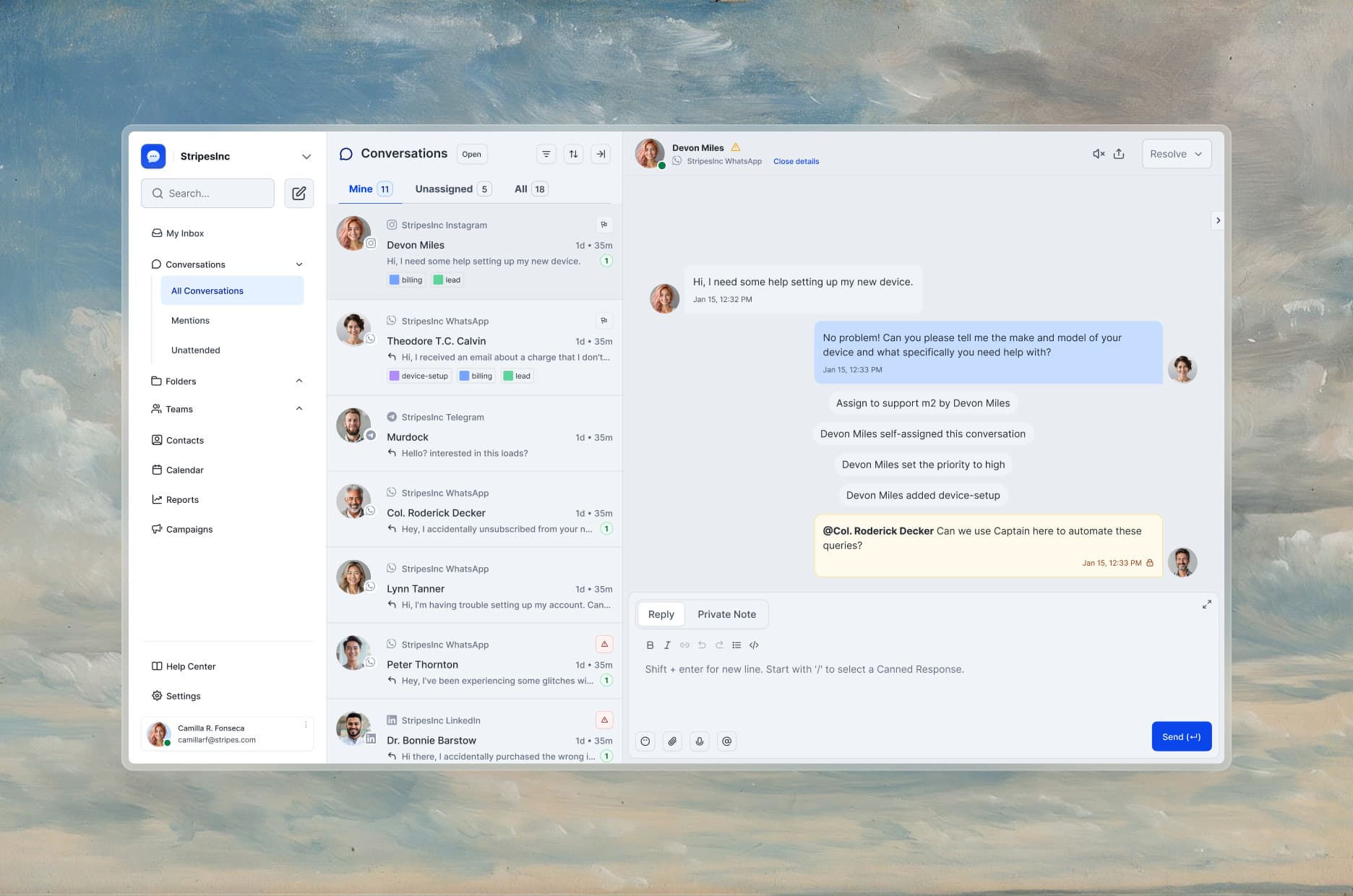
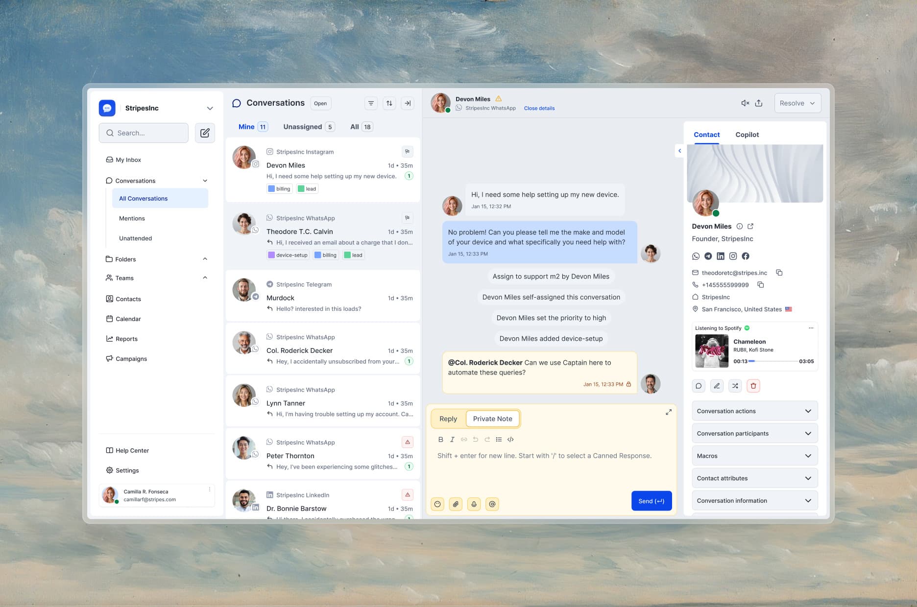
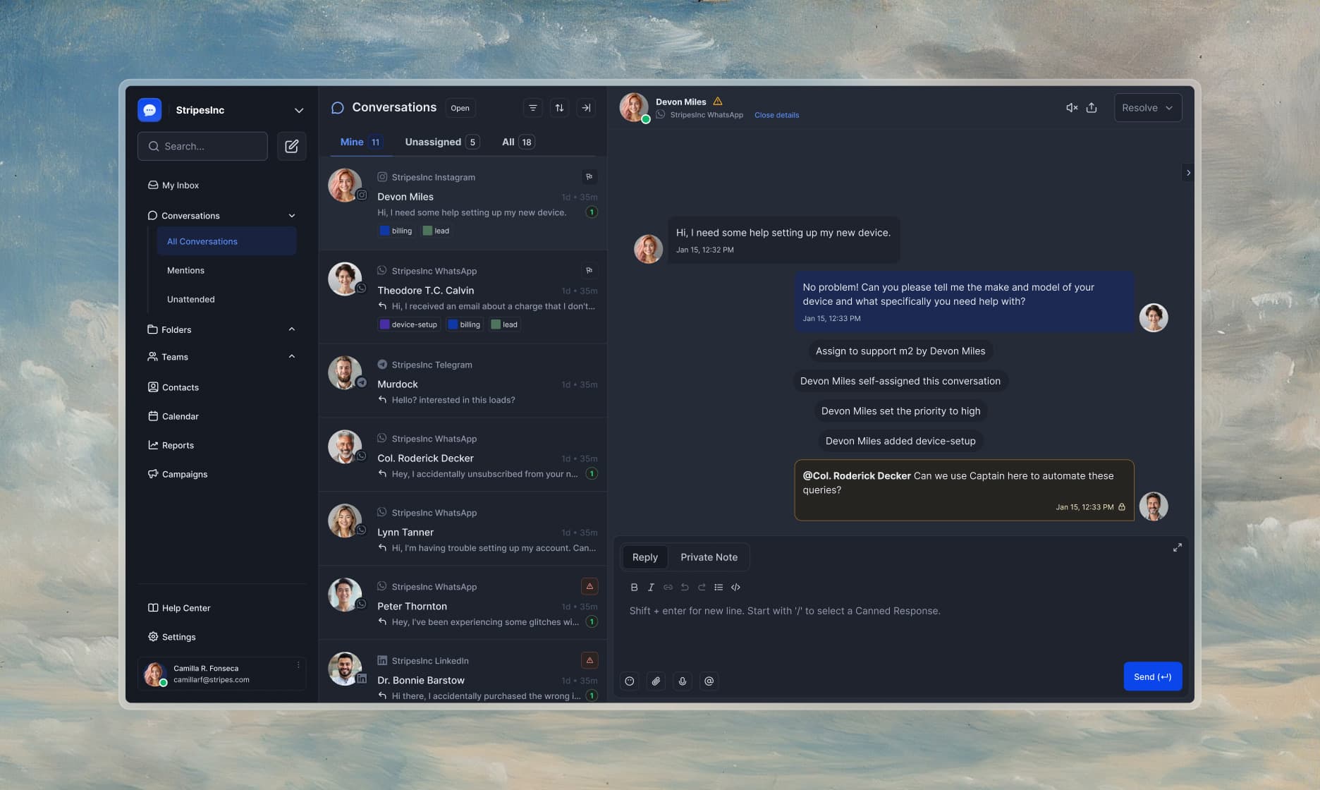
I reorganized the inbox into a clearer, more focused workspace: agents see what matters first, with priority and context on hand.
Clean, actionable, conversation-first
The conversation view was redesigned to bring the message forward and cut noise, without losing the actions the team uses constantly.
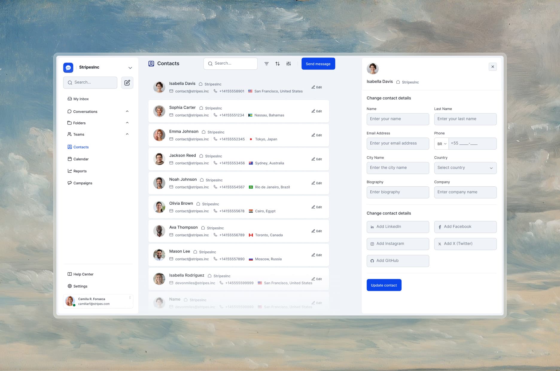
The contacts page becomes a light CRM inside the platform — customer history and data where the conversation happens.
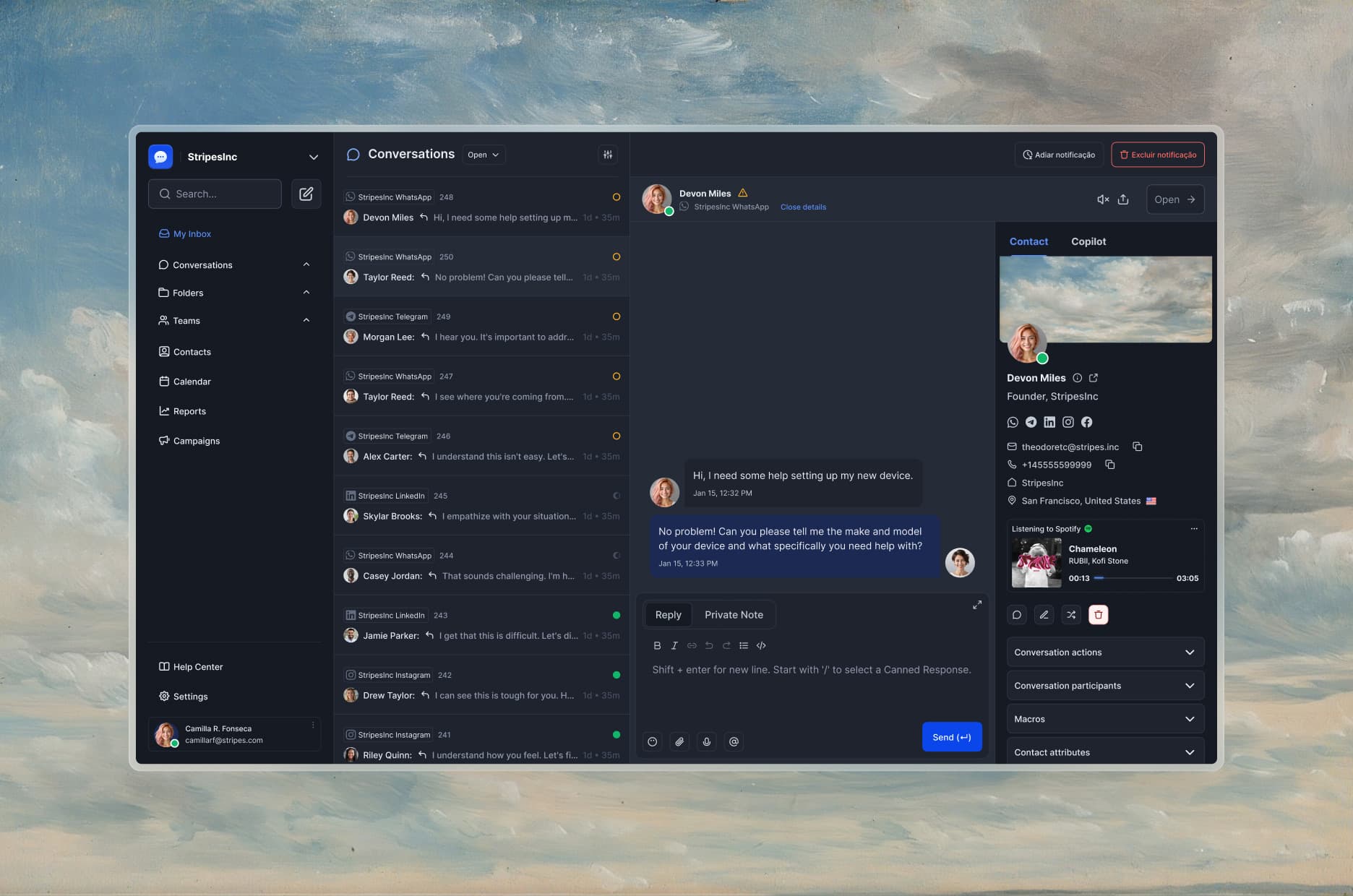
A flexible language for white-label
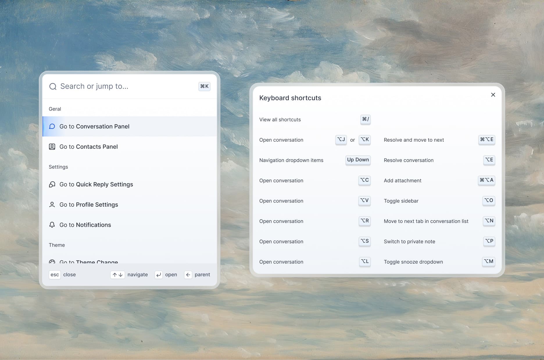
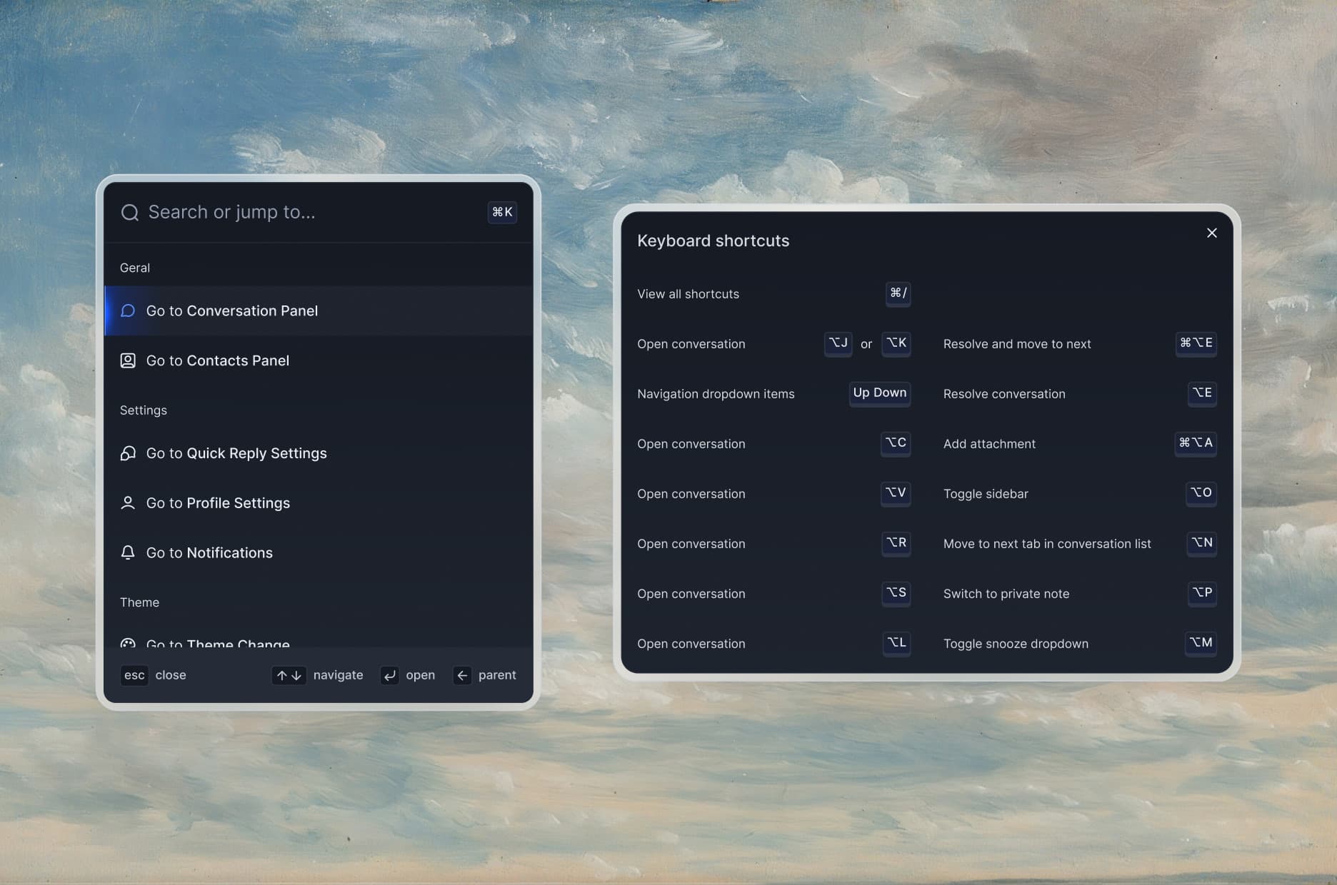
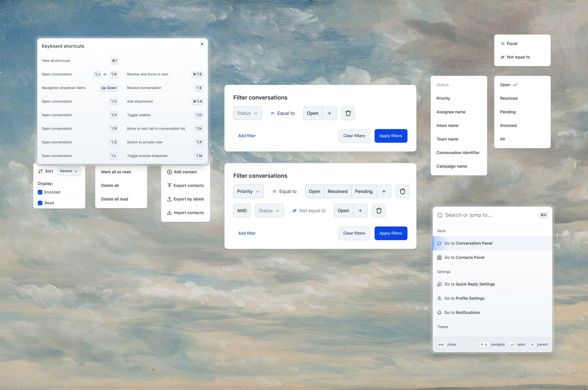
A design system built for multiple brand identities: one base, many faces, ready to deploy across clients. Padding, iconography, and component behavior stay consistent, so handoff is smoother and new modules scale.
Outcome
Scalable component library
A modular, white-label design system that cuts future design and dev costs.
Usability for high-volume teams
Flows that prioritize clarity, efficiency, and collaboration across inbox and conversations.
Visual hierarchy and accessibility
Contrast, spacing, and type improvements sharpen focus and readability across the platform.
Product thinking beyond visuals
Business-value ideas — CRM-lite, analytics-ready inbox — that expand the product's potential.
Next project
Vets and clinics near you.
2022