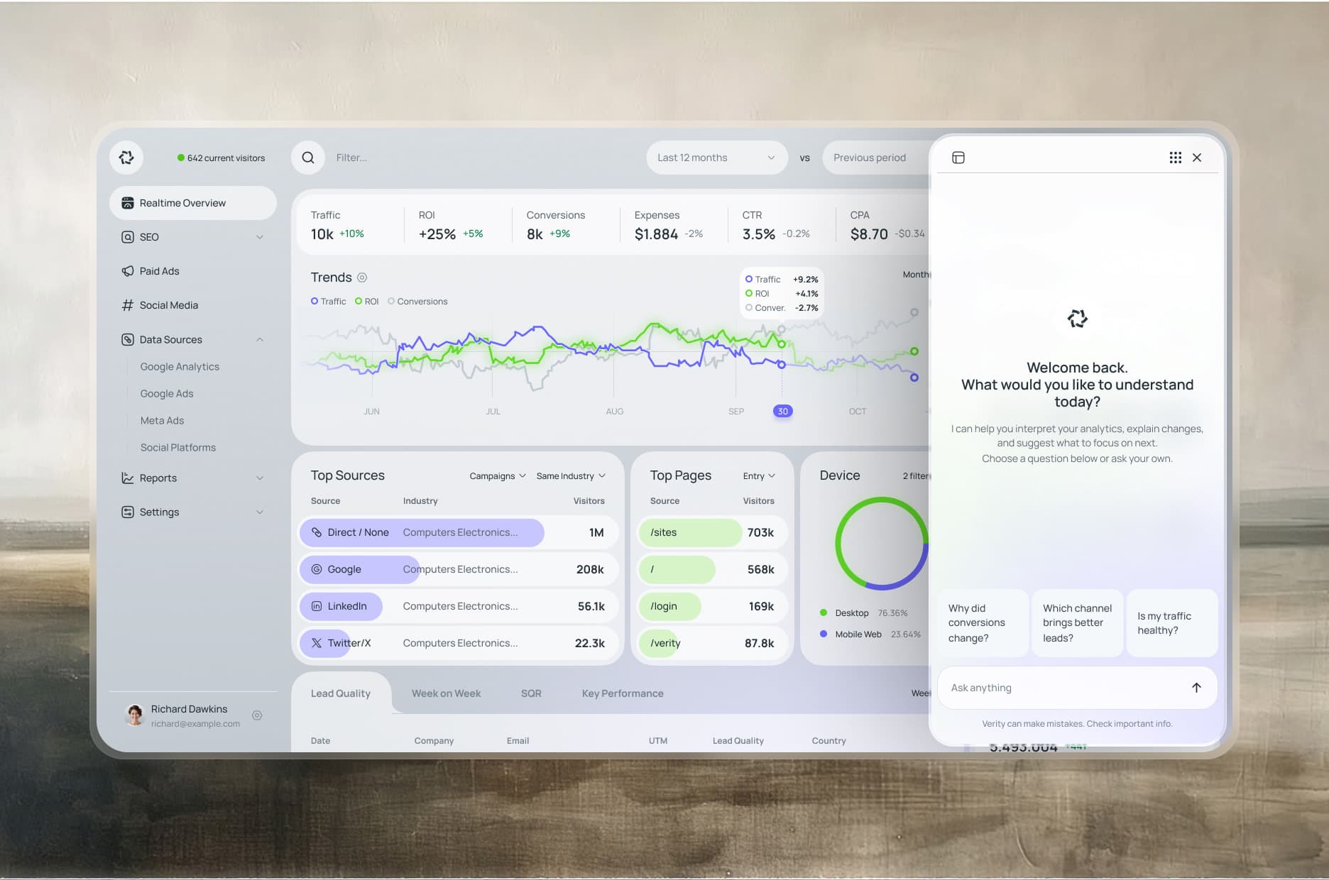
Verity is a concept analytics dashboard for marketing teams. It puts real-time traffic, SEO, paid ads, and social media in one view, fed by Google Analytics, Google Ads, and Meta Ads.
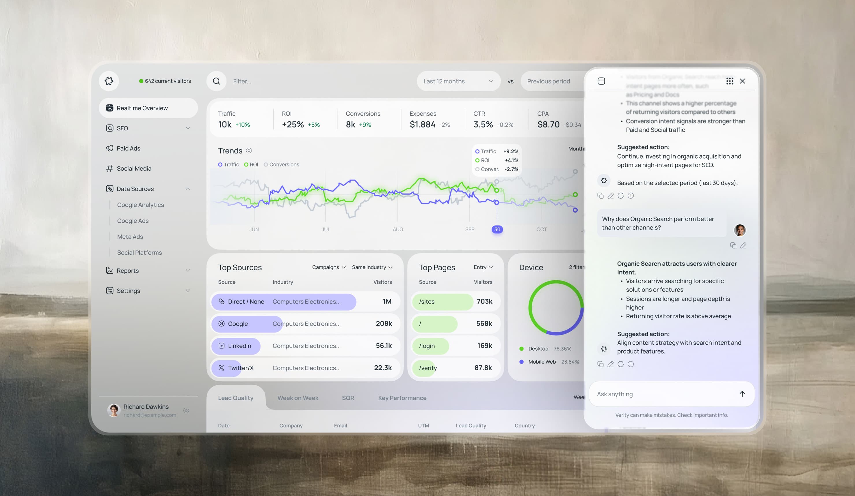
Two ideas drive it. Every lead gets an AI score, so the team sees which ones deserve a call. And an assistant explains the numbers in plain language — why conversions changed, which channel brings better leads — and suggests what to do next.
I designed Verity on my own — the dashboard, the lead-quality view, and the AI assistant that explains the numbers.
- Research
- Metric mapping
- User flows
- Strategy
- Product strategy
- Information architecture
- AI assistant design
- Design & Production
- UX & UI design
- Design system
- Data visualization
- Light and dark themes
- Platforms
- Web
- Role
- Concept · Solo
- Year
- 2026
Every channel in one real-time view
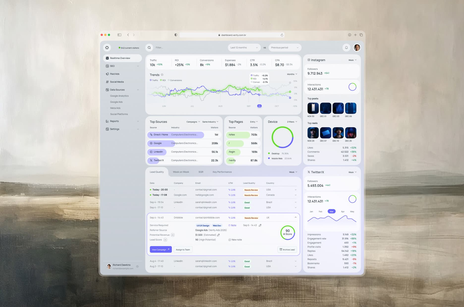
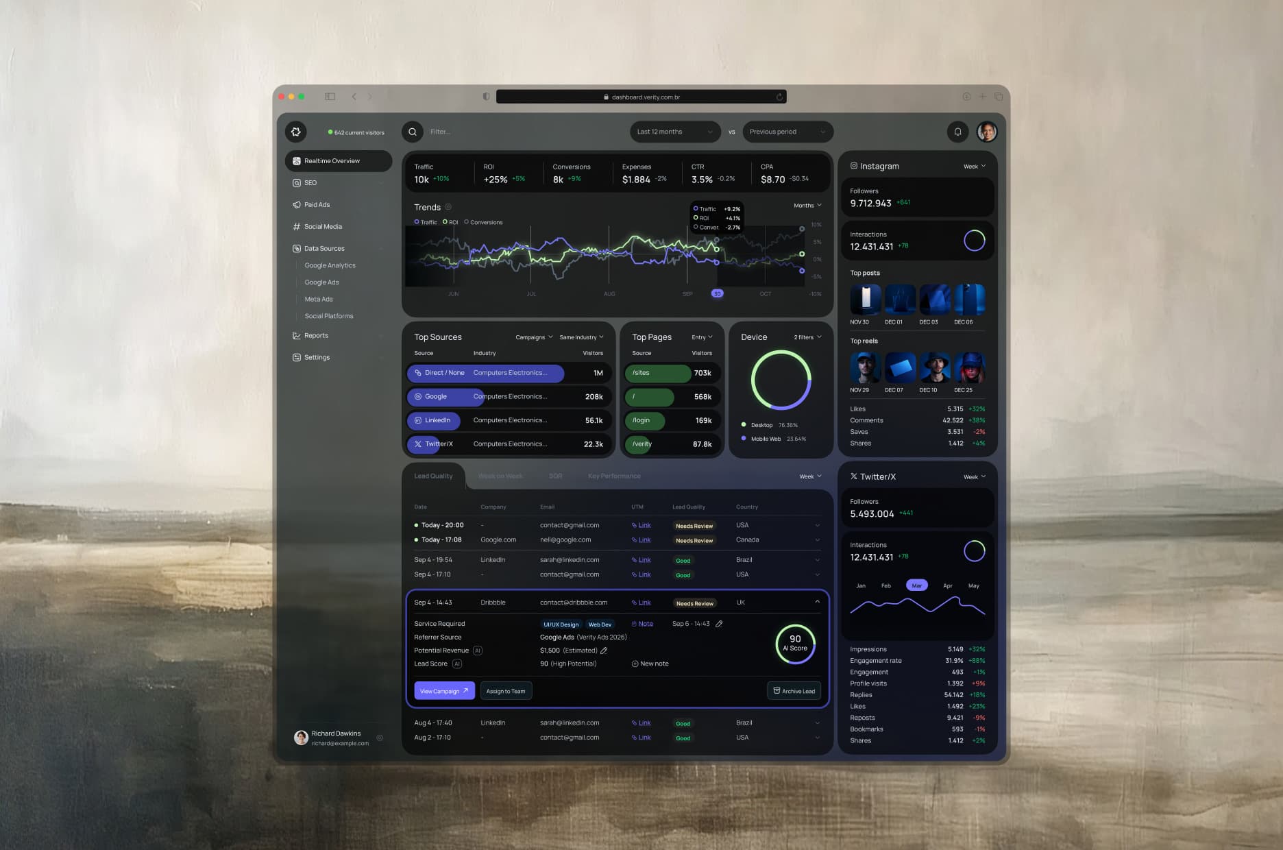
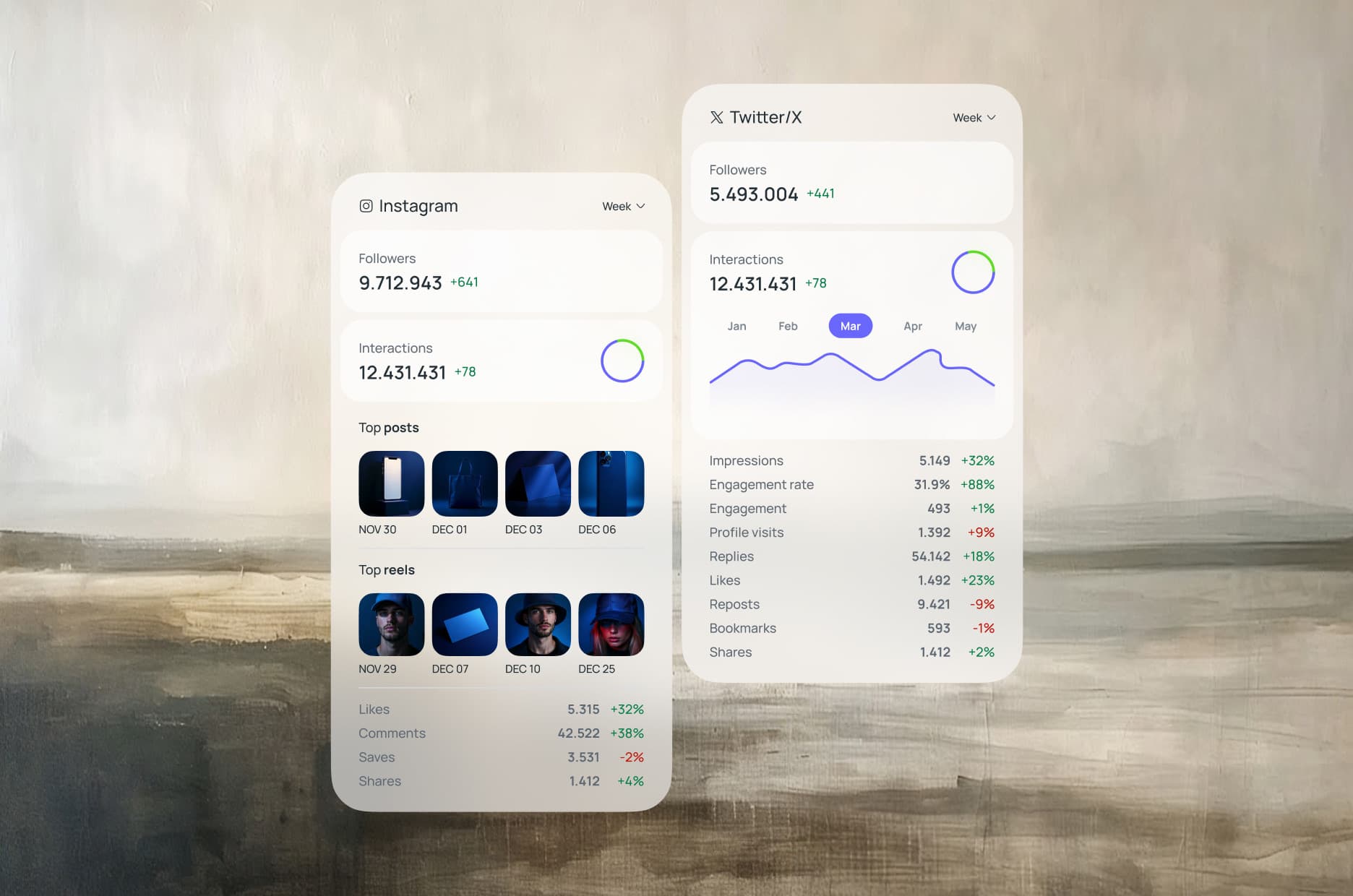
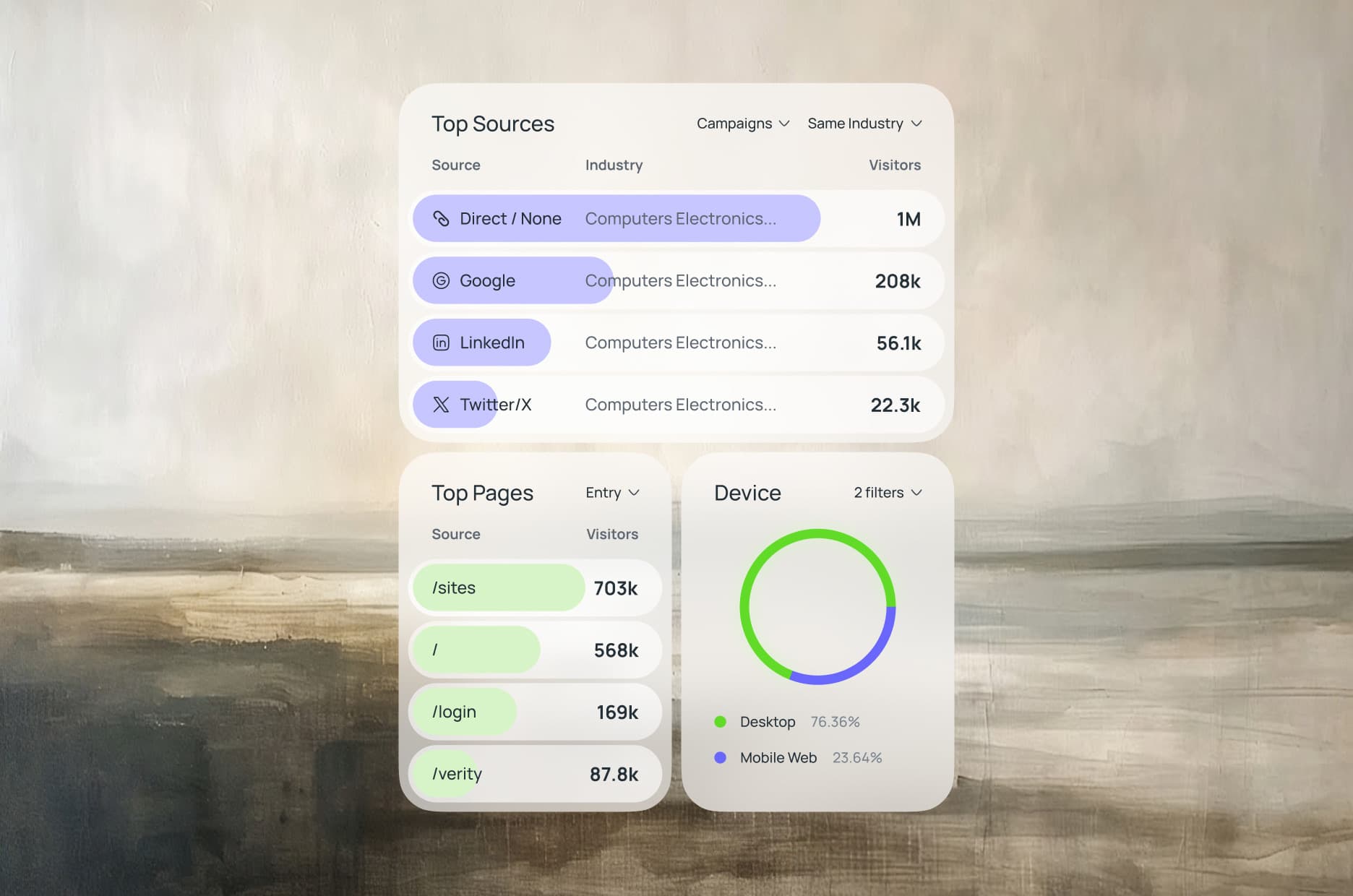
The overview puts traffic, ROI, conversions, expenses, CTR, and CPA at the top, with a trend line that crosses them. Below, the top sources, top pages, and device split show where visitors come from, and one card per social network shows followers, interactions, and top posts. SEO and paid ads get their own sections, fed by Google Analytics, Google Ads, and Meta Ads.
Lead quality, scored by AI
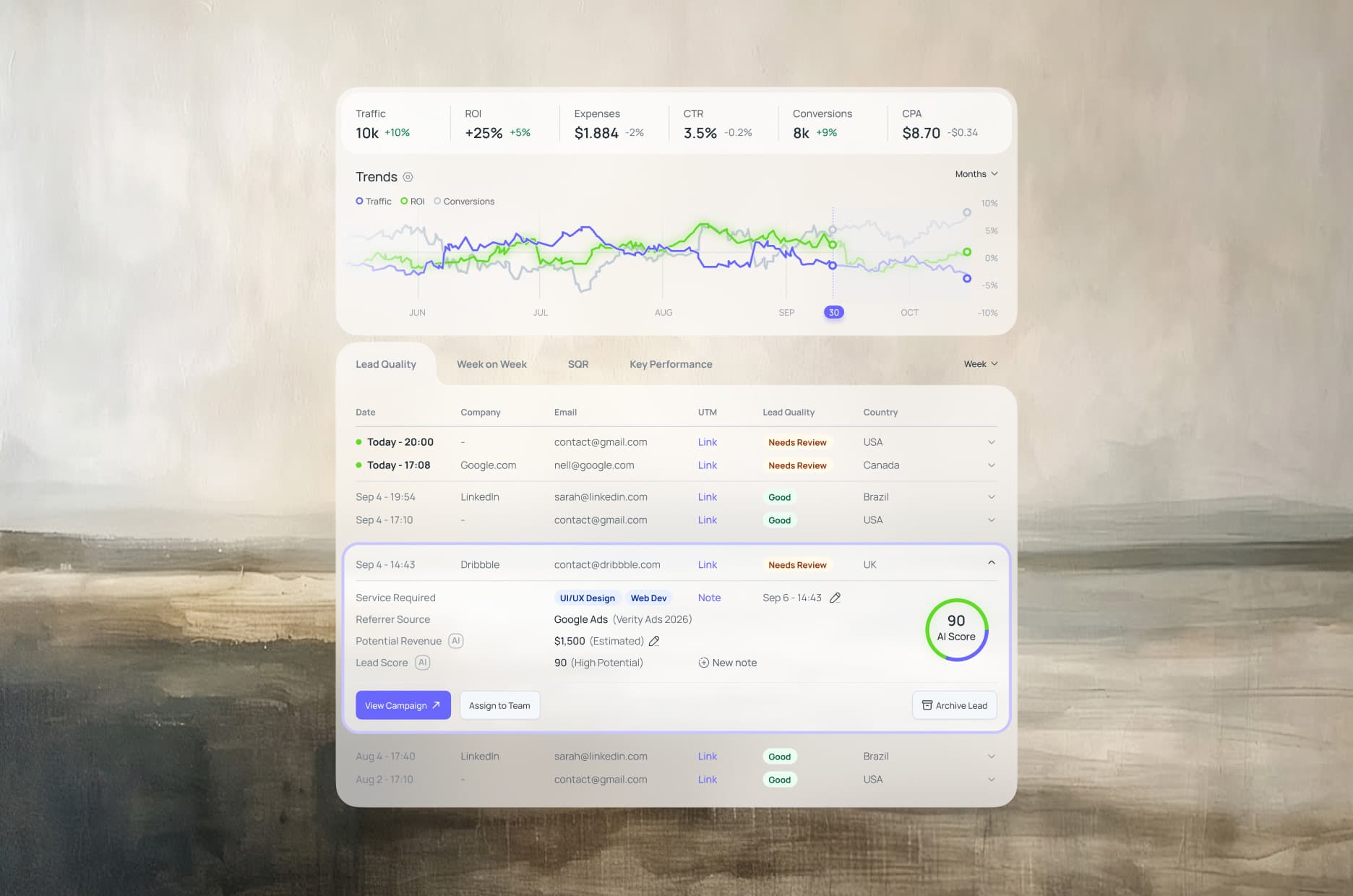
The lead table shows each contact with its source, UTM, and quality tag, good or needs review. Open a lead and the AI score appears with the service requested, the referrer, and an estimated revenue, plus the next steps: view the campaign, assign the lead to a team, or archive it.
An assistant that explains the numbers
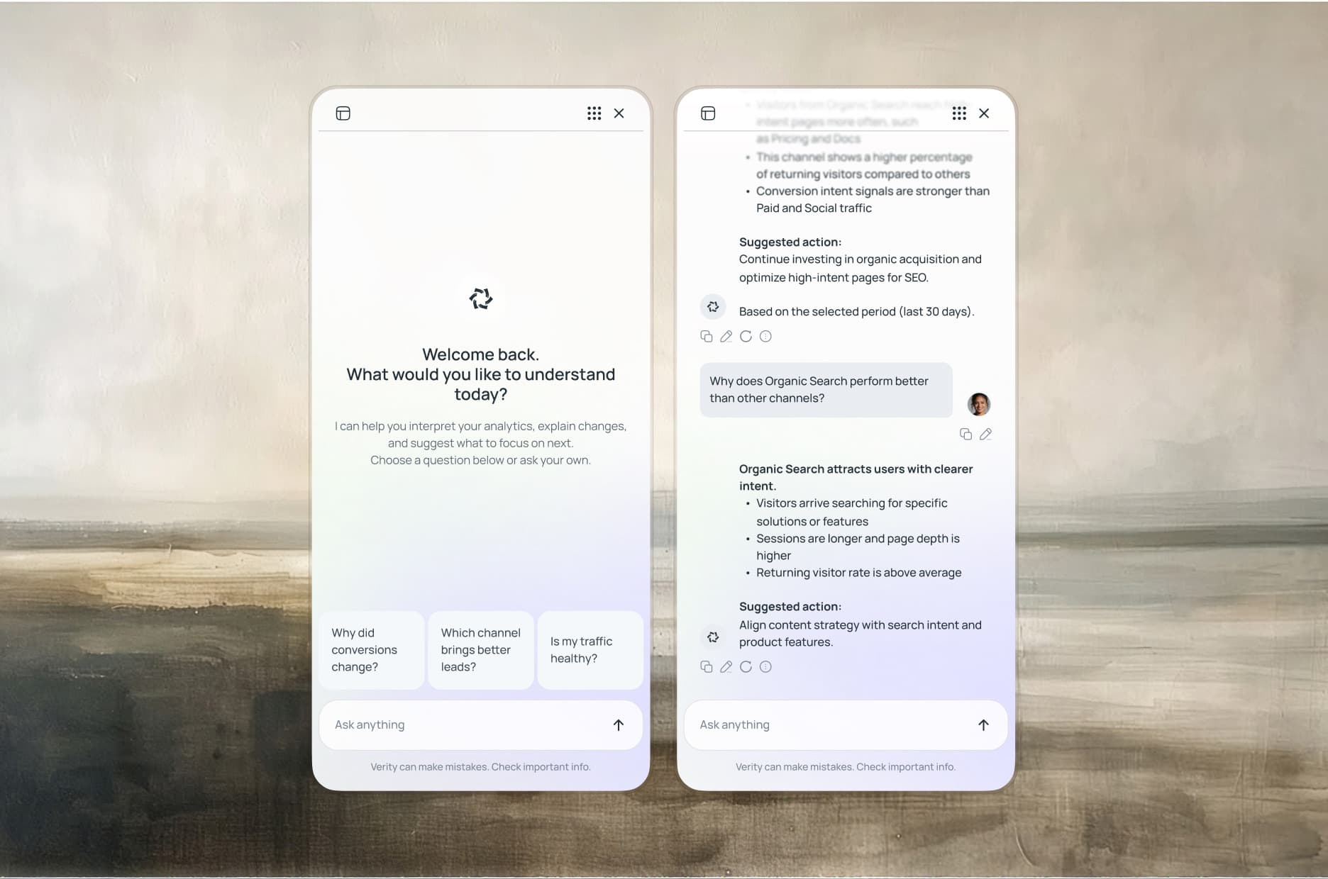
The assistant opens with questions worth asking: why did conversions change, which channel brings better leads, is my traffic healthy. Ask your own and it answers in plain language, lists the reasons, and ends with a suggested action, tied to the period you selected. It sits beside the dashboard, so the numbers stay in view while you ask.
Outcome
One view, not five tabs
Traffic, SEO, paid ads, and social media in a single real-time dashboard, fed by the tools the team already uses.
Numbers that explain themselves
An assistant answers why a metric moved and suggests the next step in plain language, so the data is readable by the whole team, not only by analysts.
Leads worth a call, first
An AI score and a quality tag show which leads deserve attention, with the source and the campaign that brought each one.
Dense data, in any light
Light and dark themes share one layout, so a data-heavy screen stays readable in any setting.
Next project
A luxury pet brand with an AI-generated campaign.
2026